Geolocated Radiocarbon Dates from Ireland: An introduction to the data visualisation
[If you like what I write, please consider throwing something in the Tip Jar on the right of the page.
Alternatively, using The Reading Room
portals for shopping on Amazon brings in some advertising revenue and costs you
nothing]
You can skip to the Visualisation
embedded at the end of this post, or go directly to my page on the Tableau Public server
[here]
Introduction
As many readers of this
blog will be aware (probably painfully), I spend much of my free time on a
research project that’s all about collecting radiocarbon determinations and
dendrochronological dates. The last publicly released version of the catalogue was
in September
2013 (though the most current version has always been freely available to researchers
who contact me directly). Back then the catalogue boasted 7015 radiocarbon
dates and 260 dendrochronological ones. As of December 2015, the catalogue now
holds 8288 radiocarbon and 313 dendro dates. As headline figures go, that’s not
bad – respective increases of 18.1% and 20.4%. But this is far from the whole
story. In the period since September 2013 I’ve endeavoured to add a number of additional
features to the resource to make it more useful to researchers. At some stage
in the near future I intend to write a post as a comprehensive introduction to
the underlying dataset and how it can be used. In the meantime, I wanted to
focus on one new aspect that (I hope) will provide a ‘more than the sum of its
parts’ addition to the dataset.
As part of my
transition away from a full-time career in archaeology and into the world of
IT, I’ve been introduced to many new ideas around data collection, management,
and visualisation. Turns out that all my time drawing graphs of this that and
‘tother in archaeology has served me well and is one of those wonderful, if
illusive, transferable skills (all
those bar charts of rath diameters and plots of sherd thicknesses were not in
vain!)! As part of this work, I get to use Tableau Desktop, probably the
leading software solution for data visualisation. Somewhere during my training
in how to use this software I thought that the geolocation functionality would
be perfect for simple but effective presentation of archaeological data. My
first plan of attack was to create a small-scale proof of concept model – just
to see if it was feasible. To this end, I put together a visualisation on the global
spread of early printing presses. This seemed to go rather well and I
decided to take on larger project on the human
costs of the First World War. At this point I reckoned that I could
successfully handle the geolocation data, but there were some further skills
that I really needed to master before taking on the radiocarbon data. As I was
becoming increasingly interested in some of the work being done by Damien
Shiels on the Irish participation in the American
Civil War, I decided to take that on as my next archaeo-historical data
visualisation project. After that, there really was no putting it off … I had
to take the plunge and get on with the radiocarbon data. Admittedly, I did get
side-tracked into looking at some aspects of the Ashley
Madison data dump, but that’s another story …
Early on, I recognised
that I would need substantial help from other people both inside and beyond the
profession to have any chance of success. Instinctively, the idea of conducting
research ‘live’ in the social media space seemed like the perfect way to
provide rapid output of results, receive speedy feedback, and act as a means of
demonstrating what the project is about in a real and tangible way. I can only
say that, from both a personal and professional standpoint, it has been a true
highlight in my archaeology career. I have been immeasurably helped by so many
people who have provided access to lists of townland names and centroid data,
provided batch conversion of the Irish Grid Reference coordinates to digital
latitude and longitude, provided data, answered my questions, looked up
reference books on my behalf, patiently emailed to say that the site I had
there should be somewhere else … I do not have sufficient words to express how
much all these acts of kindness and assistance have helped this project to
completion. By May 2015 I had geolocations for all Irish radiocarbon dates in
the catalogue. Since then I’ve been working on getting through the substantial
backlog of books and papers I’ve accumulated and adding those into the catalogue
too. It has all taken some time, but now there are geolocations for all 8288
radiocarbon dates in the collection. Not to be too technical about it, but I do
need to issue a quick word of caution about these locations: they’re the best I
can get, but they’re not perfect! In a vanishingly small number of cases I’ve
been able to put a virtual pin on the exact site – at Poulnabrone, or Knowth
for example. Where I’ve been able to positively identify the excavation, I’ve
taken the data from Wordwell’s excavations.ie
site. As the wonderful Nick Maxwell will be quick to point out, it’s a resource
still in development and one not without issues of accuracy where it comes to
this location data. One of the unexpected joys of this project has been the
lengthy correspondence that we’ve struck up where I’ve been able to pass back a
number of corrections and refinements to his data (and he to mine!). Admittedly, there have been
times where I’ve wondered how welcome this staccato barrage of emails must have
appeared to him, but he appears to still be talking to me, so that’s a good
thing! What all this comes down to is that the user can have general
expectation that the locational data is good to the centre of the townland,
there is still (like any resource) the possibility for error. The advantage a
digital Catalogue like this has over a conventional printed one is that it is
relatively quickly and easily changed once an error has been identified!
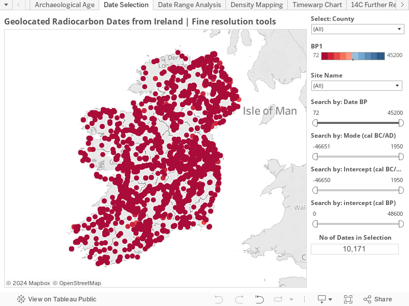
 |
| Overview of the Data Selection tab |
The Data Visualisation
First off, the
visualisation is hosted on the Tableau Public servers and can be viewed
directly there,
or through the embedded version at the end of this post. The next
recommendation is to hit F11, turning on full-screen mode … unless you’ve
already got a fairly massive computer screen it’ll reduce the amount of
vertical scrolling you’ll have to do (and hitting F11 again will bring you back
to dry land!).
The speed at which the
visualisation loads up is partially reflective of the size of the data source
(in the grand scheme of things, not huge), your connection speed to the server
and the workload that the server is under. Basically, consider that peak
day time and evening hours in the US will dramatically affect load and
refresh times. Also: it’s beyond my control! Deal with it!
Date Selection tab
Select: County
All going well, you
should see a lovely map of the island of Ireland, all covered in dots, like and
ailing patient. This is the Date Selection tab. The interactive controls on the
right hand side allow the user to set the geographic and temporal scope of
their research … or, in English … you get to choose the places and the set of
dates that’s most relevant to you! Want to see all of Ulster and parts of
Munster? It’s yours with a few judicious clicks of the mouse! Want to see Cork,
but not Kerry? The choice is yours! The top-most control is county-level, and
the default is for the entire island, but you can add and subtract counties to
your heart’s content! The counties used are the 32 ‘traditional’ Irish
counties, ignoring the new administrative districts of Dún Laoghaire-Rathdown,
Fingal, and South Dublin.
Colour scale
Directly below the
county-choice control is the colour legend. It is set to a red-blue diverging
pattern, where the youngest dates in the plot are moved towards the red end of
the scale and the oldest dates are towards the blue end. This colour scale
refers to ‘raw’ radiocarbon determination given in years Before Present (BP).
At the time of writing, the determinations range from 72BP (red) to 12,480BP (blue).
Dates in the centre, between the extremes, will appear as an off-white
reddish-blue. The important thing to remember here is that as the interactive
controls are changed, the data displayed on the map changes, and so too does
the value of the scale. For example, if you select only the radiocarbon dates
from Armagh, the colour scale stays the same, but the values it depicts change
to 245BP (red) 6925BP (blue).
Date selection
Search by: Date BP
The next four controls
are all of ‘callipers’ type (i.e. you
can move them from both ends) and all provide similar but distinct control over
the which dates are displayed. The primary driver that I have used for data
selection and display is the ‘raw’ date – the uncalibrated radiocarbon
determination. To my mind it is the best way to discuss archaeological dating
as it removes all considerations of calibration, comparing two differently
calibrated dates, and it is the most ‘reusable’ format that the date comes in.
By this I mean that you can take the date and recalibrate it with a newer
version of a different program, using the latest version of the calibration
curve and it will still have meaning and can be used. In this ‘raw’ form it is
most useful to other researchers who wish to incorporate the data into new models
and research. If you’re a professional archaeologist you should be pretty used
to this and this is probably the best choice for you. Admittedly, it’s not to
everyone’s taste (even among the professionals) and for this reason I’ve
incorporated a number of other measures that represent the radiocarbon date in
different ways.
Search by: Mode (cal BC/AD)
After much discussion
with the esteemed Dr
Rowan McLaughlin, he has convinced me to include a calibrated date mode
average. He has very kindly calculated this for me using the IntCal14 curve and
notes that any dates on marine samples will have ‘wrong’ answers. A 100 year SD
was used for those samples without this information. Dates with multiple modal
years were averaged (mean). Dates are presented as negative numbers for years
BC and positive ones for years AD. The current range is from -12770 to 1950. As
with all of the date selection controls, caution is urged in their application.
Search by: Intercept (cal BC/AD)
Intercept dates have a
bit of a bad reputation in archaeological circles as they fail to account for
the majority of the variability in a radiocarbon determination. This is pretty
much spelled out in the title of the most frequently cite paper on the topic: The intercept is a poor estimate of a
calibrated radiocarbon age. While I agree wholeheartedly with the
arguments put forward by the authors, I still find that it can be difficult to
compare calibrated age ranges in my head, or even written down on paper … my
mind always tends to fix on one of the end dates, rather than looking towards
the statistical core of the date. I don’t advocate for using intercept dates in
formal publications, but as a personal ‘ready reckoner’ I’m all for them. I’ve
set up the underlying Excel spreadsheet to calculate them automatically (using
the IntCal13 curve for terrestrial samples and Marine13 for marine ones)
whenever a new date is added to the catalogue. I’ll be honest and say that I’m
probably far too pleased with myself at working out how to batter MSExcel into
becoming my own personal calibration program (ChappleCal anyone?), but it does
have the advantage that I can quickly and easily upgrade to the next version of
the calibration curve and have all +8k determinations change automatically.
Again, dates are presented as negative numbers for years BC and positive ones
for years AD. The current range is from -12760 to 1950.
Search by: Intercept (cal BP)
This is the same
mechanism as above, but the dates are presented in years cal BP. The current
range is from 0 to 14710.
I had hoped to make all
of the callipers move in concert, so that a change in one resulted in a change
in the others. Unfortunately, this technical challenge appears to be beyond my
current skillset. However, changes in any one of these are reflected in the
colour scale. As the ‘raw’ date (BP) is the chief dimension that the
visualisation of each individual date is based on, the ‘Search by: Date BP’
callipers have a horizontal blue line that the others are missing. While the
ends of the Date BP callipers do not move when adjustments are made to the
other callipers, the length of the blue line contracts and expands to indicate
how much of the range of dates is currently covered. The point I’d make here is
that messing about to see the map change and move is all very well, but if
you’re attempting to use the visualisation of any serious research work, please
use these sets of callipers with all due caution!
Other selection tools
In the top left section
of the map space you’ll see a vertical arrangement of five icons (these
disappear when not in use, so you may have to run a mouse pointer/finger over
them to get them to appear). The top one, set alone, is a ‘search’ magnifying
glass. Clicking on it brings up a search bar where you can type in your search
query. This search is only related to the OpenStreetMap data and not the
radiocarbon dates. Thus, you can search for Mayo and see the county with all of
the recorded radiocarbon dates in the Catalogue. You can, should the mood take
you, type in Ulan Bator and be presented with a map of the capital of Mongolia
… obviously, there will be no radiocarbon dates shown. However, it will not be
able to search for the names of individual sites, even where they do have
associated geolocated, radiocarbon dates. For example, you can type in
‘Tildarg’ (775±50 BP), hit return, and the visualisation will sit there looking
back at you like a quizzical puppy … but it won’t take you to the location you
wish! Be warned!
 |
| Other selection tools |
To my mind, one of the loveliest
features of the Tableau map environment is the little circular sighting symbol
to the right of the search bar. Clicking on it will (if you choose to allow
your location to be used) centre the map on where you are, allowing an in-depth
exploration of your local area, should you wish to pursue it. It should be
noted that this change in the view does not change the overall selection of
sites, and the colour scale and date callipers will not necessarily match the
view.
 |
| The Zoom Area and data selection tools |
Below this is a
vertical band of four icons. Unsurprisingly, the large plus (+) and minus (-)
signs zoom in and out on the map. Click on the + often enough and you’ll find
yourself not far from Athlone and the date from Ardagawana 1 (2427±23 BP). Go
the other way and the continents of the planet fade into the distance, leaving
only a single red dot to mark the place of Ireland. Again, no matter how you manipulate
these views, the callipers and colour scale will remain unchanged.
Whichever way you go
and however you mangle the map view, just clicking the house-shaped ‘home’
button returns you to the opening, island-wide view of the visualisation.
The final button is a
right-facing ‘play’ arrow that pops out to reveal four selection tools. The Zoom
Area button (solid rectangle with magnifying glass) will zoom in on any
user-defined area of the map for closer inspection. Again the colour scale and
callipers do not respond to these changes. The following three selection tools
(Rectangle, Radial, & Lasso) work in the same manner, other than the
differing shapes used to capture map positions. Using any of these to select map
points will highlight the site locations, but will not alter the map. This will
bring up a floating tooltip window listing the number of dates in the selection
and giving the user the opportunity to either ‘Keep Only’, ‘Exclude’, or ‘View
Data’. If you chose the first of these, the map will zoom and centre on the
selected dates. The Select: County, colour scale, and horizontal blue bar in
the Search by: Date BP will all change to reflect these choices.
 |
| Keep Only, Exclude, & View Data functions on top edge of tooltip |
Tooltips
Hovering over any map
point will pop up a small ‘tooltip’ window. This will show the basic details of
the full radiocarbon determination, the Laboratory Identifier, and the site
name.
Undo/Redo/Reset
No matter what changes
the user makes to the visualisation they can all be easily and quickly fixed
and the presentation brought back to its starting position by using the Undo/Redo/Reset
controls. These are located along the bottom, left-hand edge of the view, just
outside the map space.
Further Reading tab
Having made your geographical
and time-period selections on the Date Selection tab, you may want to move on
to some, more specialised, reading. In this case, it’s time to explore the
Further Reading tab, located along the top edge of the presentation. This will
bring you to what is essentially a data table, but one that is tailored to your
research needs, based on your earlier choices. The data is laid out as follows:
Site, County, Lab ID, Date BP (without the ±SD), Reference, Notes. This is
followed by a thin vertical line showing the relative position of each date in
relation to those about it. Frequently, the Notes and Reference (and sometimes
the Site name too) are longer than the space allows, so hovering over any of
these will bring out a pop up with the full text. While Tableau allows you to
sort the information here, you can only effectively sort by Site name (a-z, or
z-a). Thus, all the other useful criteria, such as sort by County and, most
especially, Date BP, are ineffective. It’s not something I currently have a fix
for, but it’s certainly something I’d like to see remedied in a future release.
The references are all short form (Surname, Year, page number) and you’ll have
to download the full Excel spreadsheet catalogue (here) and
look in the References tab to see what each one is.
 |
| Overview of Further Reading tab with detailed tooltip window |
Unfortunately, this
means of reducing down the reading list only appears to work if you interact
with the map using the ‘Select: County’ and ‘Select by:’ date callipers. The
other forms of data selection noted above appear to have no influence on how this
second tab displays … which is a shame!
Tooltips
On the Data Selection
tab, I had wanted to keep it as clean and simple as possible. Thus, even the
tooltip functionality was kept to a minimum. Here, on the other hand,
I wanted to give all the data possible. Now, hovering over the vertical blue
determination line on the right of the data table will bring up a window giving
the full Determination, Lab ID, Site name, County. This is followed by the
Calibrated date at 1σ and 2σ intervals. Both the version of the calibration
curve and the version of the calibration program used to provide the calibrated
result are given. It’s probably overkill, but I’ve included both the Notes and
Reference data from the main data table, but it’s there just in case it’s
needed/wanted. Finally, and just for completeness, I’ve included the ChappleCal
Intercept dates (cal BC/AD) and (cal BP), along with Dr Rowan McLaughlin’s
calculation of the determination’s Mode.
In Conclusion
If you’ve gotten this
far, I applaud you! I’ve tried to communicate quite a bit of technical
information in as light and engaging a way as possible, but I reckon that it
still may be beyond the interest of most. Which brings me to an important point
– who is this visualisation aimed at? In the first instance, I would reckon
that all serious researchers using this form of data will immediately bypass
the visualisation and head straight for the dataset it’s all built on [free download here].
Nonetheless, I would hope that the visualisation will be of some use to them
and various researchers wanting to get a visual image of what the dataset holds
and how it may be utilised. As a stand-alone resource, I hope it will find use
with varying types of professional field archaeologist, looking for both landscape-level
and temporal parallels to their own excavated findings. I hope that it will also act as some degree of inspiration for university researchers pondering where they could profitably add to archaeological knowledge by targeting blank spaces on the map that have not been systematically dated or are under represented.
At the most general
level, I hope that it can act as a means of engaging a large portion of the
non-specialist audience who have an interest in Irish archaeology and heritage.
Such an audience may find the intricacies of both the modern excavation process
and radiocarbon dating to be somewhat complex and off-putting. I hope that this
visualisation can be used to connect these groups to the scientific excavations
and dating results that have been carried out within their own areas and act as
further spurs for interest and engagement. Basically, whoever you are and however you choose to interact with this visualisation, I hope that it will be of use and of interest and I hope that you will find what you need. Beyond that, I hope that you'll make unexpected discoveries that enhance your research, help you think in a new way, or increase your appreciation of your local area - the vizualisation is mine, but the data is yours! Now go use it!
If you experience any issues with the embedded version here, please look at the version on the Tableau Public server [here]
If you experience any issues with the embedded version here, please look at the version on the Tableau Public server [here]


Comments
Post a Comment