Corners of foreign fields: Visualising the human cost of the Great War (1914-1918)
For this project, I wanted to see
how I could use the mapping functionality within Tableau to visualise the battle
sites and casualties of World War I. As my primary data source, I’ve used the
Wikipedia article List
of military engagements of World War I, and references therein. The article
is quite good, and provides a structured list of Fronts, Theatres,
and Campaigns, with individual battles and actions listed within these
sections. I wanted to see if I could extract the baseline data from the text
and reconfigure it into a more visual entity, with a degree of interactivity
that would allow the user to create their own visualisations, based on all or subsets of the
data.
[Can't wait to explore the data? Scroll to the end of the post, or go direct to my Tableau page: here]
[Can't wait to explore the data? Scroll to the end of the post, or go direct to my Tableau page: here]
Within each action, I have gone
to the appropriate Wikipedia Page and extracted the following information: Front/Campaign;
Action; date (start & end); the location (converted to decimal Latitude and
Longitude); the belligerents
by primary grouping (Entente or Central Powers); human strength
in the field (excluding ordnance, shipping, and aviation) where available; Casualties/Losses where
available; POWs where available; the victor; along with a link to the Wiki
article. I’ve also captured notes on strength and losses to add detail as a
hover-over tool tip on the maps. Below, I provide a more detailed set of notes
on how I used the data and the decisions I had to make to get it into a useable
format. The chief point I would make here is that I’m no expert on World War I,
so this has been a learning experience for me as much as anything else. Like
many non-specialists, my primary knowledge of the war centres on the Western
Front and, as I live in Northern Ireland, the participation of the 36th (Ulster)
Division in such iconic actions as Messines, the Somme, and Passchendaele.
Beyond that, my knowledge came mostly from cinema – Peter O’Toole as Lawrence
of Arabia and Mel Gibson in Gallipoli.
After that, it all got pretty hazy. So, for me, seeing the integration of the
fronts and actions and how they all fitted into a greater whole was an
eye-opening experience. I hope this visualisation will provoke similar opportunities for understanding and
comprehension for others. It is for this reason that I have attempted to
provide as many interactive filters as possible to better interact with the
data. I've provided controls to drill down into the Front/Campaign, and select
by date of action for either everyone involved or by the chief belligerent
grouping. When brought down to the level of individual belligerents, hovering
over a map point will display a 'tooltip', giving summary notes on the
strength, casualties & losses, and POWs where they are known. Clicking on
any data point on the 'Further Reading' tab will bring up the appropriate Wiki page from where I’ve drawn my information, and allow the user to (I hope) gain more detailed
insights on individual actions, and the vast human cost of lives that conflict brings with it.
Format of the Tableau dashboards
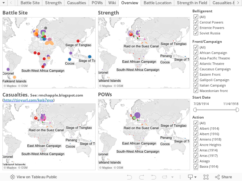
The first dashboard (Overview) in
the Tableau presentation is a set of four maps – influenced by the style of Dittmar’s arrangement of maps displaying the spread
of the printing press. These maps show various aspects of World War I and
are interlinked, so that changes to the filters that control one simultaneously
change the others. The top left map simply gives a dot for each battle site.
Top right shows the strengths known to have met in battle. Basically, the
bigger the dot, the bigger the number of soldiers involved. Bottom left gives
the known casualties, and the POWs are shown at the bottom right. In all cases
the points are coloured by the
victorious side and include categories for ‘stalemate’ and ‘inconclusive’. I
wanted this dashboard to be as clean as possible, so I’ve removed the filters down
to what I think is an absolute minimum – just the controls to select
Belligerent, Front/Campaign, and Start Date. The remaining portion of the
right-hand real-estate is taken up with a scrolling list of Actions that, based
on the choices in the previous filters, expands and contracts to only show
relevant values. I’ve removed all keys to the meaning of the colours and the sizes
of the dots as I want this to be a high-level means of interacting with the data
without extraneous distractions. The following four dashboards (Battle site, Strength,
Casualties, and POWs) take the same format - these are all accessed through tabs at the top of the visualisation, to the right of the Overview tab (to the left of the Overview tab are all my workbooks that were used to produce the Viz, but Tableau doesn't seem to allow me to show multiple Dashboard tabs without them, so just ignore them!). Based on the choices made on the
Overview dashboard, the map here will adjust to these specifications. The filters
for Belligerent, Start Date, and Action remain so more refined drill-downs into
the data can be accomplished. To add context, I’ve included dynamic keys, where
appropriate, to show the size bins represented by each dot and an explanation
of the colour keys. However, for reasons of space, I have chosen to omit the Front/Campaign
filter. My reasoning is that anyone coming to one of the secondary dashboards
has already made significant choices in what data to view. If you’re looking to
see that piece of the map, I reckon you’ll want to drill further down into the
data, not shift radically to another part of the globe. Even if you do want to,
all that is required is to go back to the Overview dashboard and reset your
choices there. A final tab lists Further Reading and provides a list of the individual Actions, the Front/Campaign, a short URL to the relevant Wiki page, along with a small visual indicator as to which year the action took place. Clicking on any of these will bring up the relevant Wiki page in a new browser tab. This, too, is filterable by Front/Campaign, Start Date, and Action, and the filters dynamically react to previous choices.
Deficiencies
I’ve spent quite a bit of time
collecting the data and designing the dashboards, so I’m justifiably reluctant
to discuss potential deficiencies. Nonetheless, it’s important to address
certain issues. As previously stated, my chief deficiency that I bring to this
project is that I’m no WWI scholar. I’ve relied exclusively on the information available
within Wikipedia and, by extension, the trustworthiness of
that information. While any perusal of the individual entries shows how variable
the level of detail is regarding the numbers of combatants and casualties etc., it has been more difficult to
assess the actions I’ve missed and neglected to include in the dataset (my ‘unknownunknowns’). For example, my primary
list notes the Second Battle
of Dover Strait (1917) but fails to include the First Battle
from the previous year. In reading about the 36th (Ulster)
Division, I realized that the Battles of Haelen (1914)
and Courtrai
were missing. These have all been added in, but I’ve still no real idea of what
I’m missing. I suspect that, while I’ve got most of the broad strokes, there
are significant lacunae. As it stands, my data accounts for 12,980,970
casualties and 2,394,171 POWs, far short of the estimated 37,000,000
dead and injured. If anyone wants to develop this as a more accurate
resource, I’m happy to turn over my data and give advice I can, but I don’t
foresee myself undertaking any large-scale research project to expand the
dataset. The other major deficiency in this visualisation is down to my inability to plot duration of action. If you’re
looking at the all or parts of the data set for the entire course of the war –
from August 1914 to November 1918 – everything looks fine. It’s only when you
attempt to use the double ended slider for fine-grained analysis that issues
occur. While I have recorded beginning and end dates for all entries, only the
beginning dates will appear on the map. For example, although the East
African Campaign lasted for the entirety of the conflict, it will only
appear on the map when the slider is set to include August 1914. I have tried
unsuccessfully to remedy this, but without success. In the absence of a technical
solution, I can only suggest that you use the time slider with caution!
Notes on the data
I’ve taken the decision to create
two entries for each action. One lists the strengths, losses, etc. for the Entente Powers, and the other for the Central Powers. This was done for convenience and doesn't generally cause any issues, except where the user is looking for details in the hover-over Tooltips. In this case, Tableau sees that there are two different pieces of data to display and defaults to an asterisk (*). This can be resolved by selecting only one of the belligerents at a time and viewing the notes individually.
Where there are a range of
possibilities listed, say, the numbers of recorded casualties, I have in all
cases gone for the lower number. Where the numbers are given as Divisions, I have
used the minimum number of 10,000 soldiers, except for American Divisions that
were commonly of 20,000 men. Similarly, a Brigade is given as one third
of Division, so I’ve chosen the round figure of 3000. In the absence of other
data, I’ve taken the minimum number of two Divisions in a Corps, 300 soldiers in a Battalion; and 1000 in a Regiment. However, in many
cases there is simply no real idea of how many soldiers were engaged in the
action and while I lament the lack of data, I’ve not attempted to speculate. In
some instances, like the Battle of Le Cateau,
there are losses listed, but no figures are given for strength. Here, I’ve
simply reasoned that there must have been at least as many troops as
casualties. Thus, if there are 5000 casualties listed, I’ve merely given the
strength as the same. With regard to casualties, my original plan had been to
list out dead, wounded, and POWs as separate data fields. Unfortunately, the
way the data is recorded is relatively variable, so I’ve been forced to lump
the dead and injured together as a single category, taking the POW numbers
where they are occasionally available.
Some large actions are composed
of a number of smaller actions and have been broken down into these constituent
parts. For example, the Battle of the
Frontiers has been deconstructed into a series of smaller battles at Mulhouse, Haelen, Lorraine, the Ardennes, Charleroi, and Mons. The Somme offensive
was composed of numerous smaller engagements (First day on the
Somme; Albert;
Bazentin Ridge;
Fromelles; Delville Wood; Pozières; Guillemont; Ginchy; Flers–Courcelette;
Morval; Le Transloy; Thiepval Ridge;
Ancre
Heights; The
Ancre) and each is mapped separately. Similarly, the Monastir Offensive
in the Macedonian Front
is broken into its constituent actions at: Malka Nidzhe, Kaymakchalan, and
Crna Bend
(1916). The Vardar
Offensive is divided into its two main actions at the Battles of Dobro Pole and Doiran (1918). By
the same token, the Battle of the Lys
was composed of several smaller actions (Battles at Estaires, Messines,
Hazebrouck, Bailleul, Kemmel, Béthune, and the Scherpenberg), but do not
receive individual attention within Wikipedia, so they have been graphed as a
single entity.
The Battle of Mulhouse had two
distinct periods of action (7–10 August 1914 & 14–26 August 1914) but is
recorded as a single event with one start date (7 August) and one finish date
(26 August). Similarly, the Second Battle of the Aisne has two periods of
action (16 April – 9 May, 24–26 October 1917), but is mapped as a single
entity.
Some events, though they involved
large numbers of people and resulted in significant loss of life, are more
difficult to map. For example, the Russian Great Retreat
took place across Galicia and Poland, but I’ve merely located it on the San River where some of the
action took place. The October
Revolution, while not a conventional action (i.e. two forces facing each other across a battlefield), was
nonetheless an important event with serious repercussions for the outcome of
the war. For this reason, I’ve included it. Operation Faustschlag,
an initiative to capitalize on the Russian withdrawal after the October
Revolution was a complex and fast-moving series of events where German and Austro-Hungarian
forces advanced to within 100 miles of Petrograd. Rather than attempting to map
the breadth of this action, I’ve taken the simple expedient of plotting the
activities as a single point at Brest, Belarus, where
the treaty
ending Russian participation in the war was signed. Similarly, the Morava Offensive in
the Serbian Campaign was carried out along a front from Leskovac to Negotin, though I’ve only
chosen to map the former point. Again, the Ovče Pole
Offensive was fought along a front between Vranje, Serbia and Berovo, Macedonia. Once again,
for convenience, I’ve simply plotted the action at the former city. The East
African Campaign was fought over portions of Modern Tanzania, Zambia,
Mozambique, Rwanda, Burundi, Kenya, Uganda, and DR Congo. As a compromise between
attempting to detail all individual actions (which I neither have the time,
knowledge, patience, or desire to do) and leaving it off the map, I’ve simply
gone for placing a dot in the southern portion of, what is today, DR Congo, in
the approximate centre of the conflict zone. For the sake of completeness, I’ve included
the Pursuit
of Goeben and Breslau as a single dot off the coast of Istanbul where they
ended up, rather than attempting to plot the path they and the Royal Navy took
through the Mediterranean.
Despite the breadth of data
available in Wikipedia, it comes down to the fact that it just doesn’t cover
everything. For example, there is no entry for the Fall of Damascus in
the Sinai
and Palestine Campaign. This is particularly pronounced in the Mesopotamian Campaign,
where no pages exist for several actions of various sizes (The Captures of Amara and Tikrit, along with
the Battles of Nasiriyeh,
Khanaqin, Jebel Hamlin,
and Istabulat).
In such cases, I’ve been forced to omit them from the dataset.
The single most difficult
category of data to deal with has been the naval engagements. By their nature,
they can be relatively wide-ranging. As discussed above, I’ve had to make
decisions about how and where they appear on the maps. Beyond that, the chief
difficulty has been that the human level data is frequently missing from the
Wikipedia articles. Numbers and types of ships are most commonly given in ‘Strength’
and ‘Casualties and losses’ data, but in the majority of instances, there is little account of
the numbers of sailors who partook and perished in these encounters.
Notes not on the data
The title of this post is based
on Rupert Brooke’s
1914 poem ‘The
Soldier’. However, if I’m to be honest, I encountered his work not through any
particular love of poetry, but through early exposure to the music of Pink Floyd, specifically
their underrated 1983 masterpiece The Final Cut.
Listen to it for free: here.
The human cost of the Great War (1914-1918)
The human cost of the Great War (1914-1918)


Comments
Post a Comment