Irish Artefacts in the British Museum: An Interactive Analysis
Some time ago I was
struck by the idea to comb through the online British Museum catalogue to find
artefacts in their collections that came from Ireland. This was a terrible
idea. It was terrible not because there was so little, but because there was so
much – had I any idea of how much work was involved, I’d probably have been
best advised to leave it alone. As I appear to be unencumbered by common sense
I pressed on and have begun publishing a series of blog posts that seem quite
well received. Each post usually represents a single traditional county and
lays out the material in broadly chronological order. A Table of Contents to
these posts can be found [here].
In putting together my
brief introductory comments on each post, outlining the most common materials, periods
represented, and artefact types etc. I’ve relied on a hastily assembled data
visualisation created in Tableau. I had thought to develop it a little further
and release it as an additional resource to the series of posts. The thing that
was stopping me was the feeling that data like this needs to be mapped to be
most effective. True, some of the BM entries include individual townland names
– some even have grid reference! But these are in the minority. Frequently,
finds are located just to the county, or just given as ‘near’ a town or
village. For all that, I still reckoned that it was worth pursuing to see if I
could get them (in some form) onto a map. I’ve done my best, but some of it is
pure guess work. For example, if there are two townlands of the same name and
I’ve no reason to suspect one over another, I’ve just picked the first one.
Where I’ve got nothing beyond the name of the county to go on I was tempted to
leave it off the map. However, the more I thought about it, the more I felt
that they should be visible on the map in some way. That’s why, although no
artefacts in the dataset were recovered from off-shore sites, some appear to be
positioned either in the Atlantic or the Irish Sea. This doesn’t really cause
too much difficulty where the county has even a little coastline, but it can
look a bit odd for the landlocked ones.
Let's look at the dashboard:
Let's look at the dashboard:

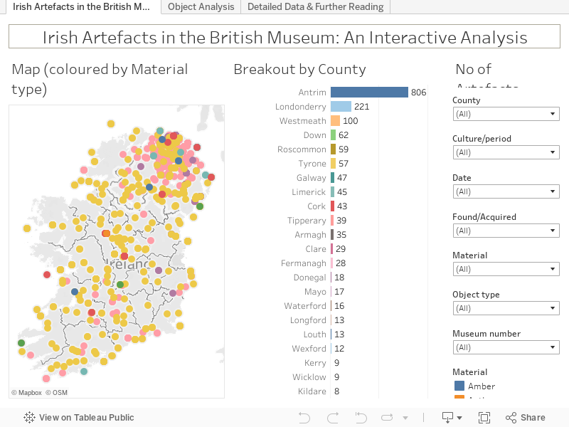
Irish Artefacts in the British Museum tab
On the left we have the
map, with a dot for each artefact and coloured by the major material type used.
If several artefacts are located to the same spot, they are stacked and only
the top one will be visible. To the right is a bar chart of the Counties in the
dataset with the number of artefacts from each. Clicking on one of these bars
(Ctrl+click for multiples) refilters the map to that selection. In the top right
corner, there’s the ‘No of Artefacts’ that shows a count of the items currently
in view. Below this are a series of filters that allow the User to investigate
and interrogate the data by County, Culture/period, Date, where it was
Found/acquired, Material, and Object type. If the User is looking for a specific
artefact with a known Museum number the last filter allows them to get to
exactly this. These filters are reproduced on all subsequent pages and choices
made on one filter affect all other graphs using this datasource.

Object Analysis tab
This tab has four
breakouts of the data in the form of horizontal bars. Users can see the
Location Found, the Culture/Period, the Material, and the Object Type. Again,
clicking on one bar will refilter all other graphs.

Detailed Data & Further Reading tab
For Users wanting a
deeper look at individual artefacts or groups of objects, this tab lays out the
available information in tabular form. The dot of colour at the right of each
line indicates the material used, but serves the useful purpose of providing a
‘Tooltip’ or ‘hover-over’ with all the information. If this is still not
enough, and the User needs to see the British Museum online catalogue entry
there’s no need to go searching. All that is required is to click the colour
dot and a ‘GoTo British Museum’ hyperlink to that record appears at the bottom
of the Tooltip.

One final feature I’d
like to mention is new to recent releases of Tableau. When the User hovers over
a colour dot and sees the Tooltip they can now interact with the data through
the pop-up. Now, running the mouse over the Tooltip window shows certain terms
underlined. Clicking on one of these terms will highlight other entries that
match the same criteria. For example, on the Detailed Data & Further
Reading tab, clicking on Object Type of ‘ring’ highlights the colour dots for
every other artefact meeting this criterion. The top of the Tooltip also lists
the number of entries that have been highlighted. The same approach may be used
with the map on the first dashboard and will filter the Breakout by County bar
chart too.

At the time of writing
data is available for nine counties and more will become available as the main
set of posts go live.
An embedded version of
the dashboard is available below, but if you experience any issues you may wish
to use the version on my TableauPublic page [Here] or go for the Full Screen option (button on bottom right of dashboard).
For the best viewing experience, it’s recommended that you use a machine with a large screen
– desktop or laptop machines. Tablets are more problematic and smart phone-sized
devices are right out!


Comments
Post a Comment